| Ver tema anterior :: Ver tema siguiente |
| Autor |
Mensaje |
kryss 


Registrado: 13 Sep 2009
Mensajes: 2169
Ubicación: Canada
Expire: 2017-09-18
|
 Publicado: Vie Jun 07, 2013 3:02 pm Asunto: Not sure about this one,comments please. |
|
Publicado: Vie Jun 07, 2013 3:02 pm Asunto: Not sure about this one,comments please. |
|
|
kryss wrote:

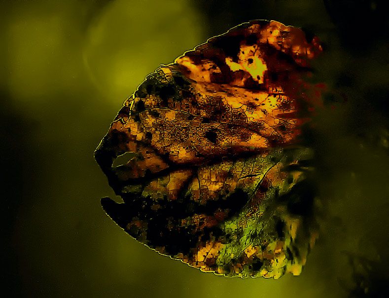
Cropped to size,RAW file in ACR, clarity added and background darkened. I like it but what do you think? please be excruciatingly honest.Thanks. |
|
| Volver arriba |
|
 |
Aanything
Registrado: 27 Ago 2011
Mensajes: 2187
Ubicación: Piacenza, Italy
Expire: 2014-05-30
|
Publicado: Vie Jun 07, 2013 3:09 pm Asunto: |
|
Publicado: Vie Jun 07, 2013 3:09 pm Asunto: |
|
|
Aanything wrote:
I like the stark contrast, but it looks a bit like it has been extremely (destructively) noise reduced, and then extremely (too much) sharpened.
So, for my taste, it doesn't work, maybe you could use this as a lower opacity layer to to multiply over the original image, maybe after blurring this one a bit, so that you can keep the dark shadows.
_________________
C&C and editing of my pics are always welcome
Samples from my lenses
My gear
My Flickr |
|
| Volver arriba |
|
|
buerokratiehasser

Registrado: 12 Jun 2011
Mensajes: 470
|
Publicado: Vie Jun 07, 2013 3:15 pm Asunto: |
|
Publicado: Vie Jun 07, 2013 3:15 pm Asunto: |
|
|
buerokratiehasser wrote:
Intriguing colors and contrast
Looks a bit boring, not sure why.
It may just be the orientation of the thing, flat symmetrical,
or it does not work at this small size since lack of details.
So much my opinion, I dont have much clue about artsy partsy. |
|
| Volver arriba |
|
|
DR.JUAN
Registrado: 08 Feb 2013
Mensajes: 661
|
Publicado: Vie Jun 07, 2013 3:25 pm Asunto: |
|
Publicado: Vie Jun 07, 2013 3:25 pm Asunto: |
|
|
DR.JUAN wrote:
Imho, excesive pp.
Very nice subject, i like it a lot.
I like to watch the original pic |
|
| Volver arriba |
|
|
Rick1779

Registrado: 17 Mayo 2013
Mensajes: 1207
Ubicación: Italy
Expire: 2014-06-06
|
Publicado: Vie Jun 07, 2013 3:29 pm Asunto: |
|
Publicado: Vie Jun 07, 2013 3:29 pm Asunto: |
|
|
Rick1779 wrote:
Agree with Aanything and I like to watch the original pic too |
|
| Volver arriba |
|
|
kryss
Registrado: 13 Sep 2009
Mensajes: 2169
Ubicación: Canada
Expire: 2017-09-18
|
Publicado: Vie Jun 07, 2013 5:11 pm Asunto: |
|
Publicado: Vie Jun 07, 2013 5:11 pm Asunto: |
|
|
kryss wrote:
aanything...First it was backlit no sharpening,Used full clarity in ACR (which subjectively I prefer) no noise reduction just removal of background structure in NIK/GIGGLE and vibrance added in Photoshop,but I have sold 3 framed prints of this, one 11x14 and two 16x20,might be your monitor,I have 27" apple cinema which is calibrated weekly with Spyder @2.2 Gamma. I will locate original & post in couple of days bit busy at moment.Your comments are appreciated.Regards |
|
| Volver arriba |
|
|
visualopsins


Registrado: 05 Mar 2009
Mensajes: 11698
Ubicación: California
Expire: 2027-07-11
|
Publicado: Vie Jun 07, 2013 5:40 pm Asunto: |
|
Publicado: Vie Jun 07, 2013 5:40 pm Asunto: |
|
|
visualopsins wrote:
I like it. It is too dark imho -- the detail is intriguing but seeing more of it is frustrated by the overall darkness.
_________________
☮☮☮☮☮☮☮☮☮☮☮☮☮☮☮☮☮☮☮☮☮☮☮☮☮☮☮☮☮☮☮☮ like attracts like! ☮☮☮☮☮☮☮☮☮☮☮☮☮☮☮☮☮☮☮☮☮☮☮☮☮☮☮☮☮☮☮☮
Cameras: Sony ILCE-7RM2, Spotmatics II, F, and ESII, Nikon P4
Lenses:
M42 Asahi Optical Co., Takumar 1:4 f=35mm, 1:2 f=58mm (Sonnar), 1:2.4 f=58mm (Heliar), 1:2.2 f=55mm (Gaussian), 1:2.8 f=105mm (Model I), 1:2.8/105 (Model II), 1:5.6/200, Tele-Takumar 1:5.6/200, 1:6.3/300, Macro-Takumar 1:4/50, Auto-Takumar 1:2.3 f=35, 1:1.8 f=55mm, 1:2.2 f=55mm, Super-TAKUMAR 1:3.5/28 (fat), 1:2/35 (Fat), 1:1.4/50 (8-element), Super-Multi-Coated Fisheye-TAKUMAR 1:4/17, Super-Multi-Coated TAKUMAR 1:4.5/20, 1:3.5/24, 1:3.5/28, 1:2/35, 1:3.5/35, 1:1.8/85, 1:1.9/85 1:2.8/105, 1:3.5/135, 1:2.5/135 (II), 1:4/150, 1:4/200, 1:4/300, 1:4.5/500, Super-Multi-Coated Macro-TAKUMAR 1:4/50, 1:4/100, Super-Multi-Coated Bellows-TAKUMAR 1:4/100, SMC TAKUMAR 1:1.4/50, 1:1.8/55
M42 Carl Zeiss Jena Flektogon 2.4/35
Contax Carl Zeiss Vario-Sonnar T* 28-70mm F3.5-4.5
Pentax K-mount SMC PENTAX-A ZOOM 1:3.5 35~105mm, SMC PENTAX ZOOM 1:4 45~125mm
Nikon Micro-NIKKOR-P-C Auto 1:3.5 f=55mm, NIKKOR-P Auto 105mm f/2.5 Pre-AI (Sonnar), Micro-NIKKOR 105mm 1:4 AI, NIKKOR AI-S 35-135mm f/3,5-4,5
Solinon 1:5.6/18 ASPH.
Tamron SP 17mm f/3.5 (51B), Tamron SP 17mm f/3.5 (151B), SP 500mm f/8 (55BB), SP 70-210mm f/3.5 (19AH)
Vivitar 100mm 1:2.8 MC 1:1 Macro Telephoto (Kiron)
|
|
| Volver arriba |
|
|
Aanything
Registrado: 27 Ago 2011
Mensajes: 2187
Ubicación: Piacenza, Italy
Expire: 2014-05-30
|
Publicado: Vie Jun 07, 2013 5:57 pm Asunto: |
|
Publicado: Vie Jun 07, 2013 5:57 pm Asunto: |
|
|
Aanything wrote:
| kryss escribió: |
| aanything...First it was backlit no sharpening,Used full clarity in ACR (which subjectively I prefer) no noise reduction just removal of background structure in NIK/GIGGLE and vibrance added in Photoshop,but I have sold 3 framed prints of this, one 11x14 and two 16x20,might be your monitor,I have 27" apple cinema which is calibrated weekly with Spyder @2.2 Gamma. I will locate original & post in couple of days bit busy at moment.Your comments are appreciated.Regards |
It must be my monitors then
[EDIT]
checked on calibrated monitor: I definitely see some artifacts that - I guess - come from using full clarity in ACR, and some degradation in color gradients that should be originated from the removal of background structure.
That said, it's a good shot, I thought you wanted comments on PP, since it looks like much of it is involved, and under this regard I think a bit less would have been a bit better.
But then everything is subjective so it was just to say.
_________________
C&C and editing of my pics are always welcome
Samples from my lenses
My gear
My Flickr |
|
| Volver arriba |
|
|
Nesster

Registrado: 24 Abr 2008
Mensajes: 5883
Ubicación: NJ, USA
Expire: 2014-02-20
|
Publicado: Vie Jun 07, 2013 6:22 pm Asunto: |
|
Publicado: Vie Jun 07, 2013 6:22 pm Asunto: |
|
|
Nesster wrote:
I'd consider cropping off the top blurry bit, and maybe just concentrating on the edges and colors. Kind of make it a huge landscape rather than a leaf.
Ultimate sharpness isn't always a good thing, some photos are more effective with a little less pop, or with the pop selectively applied.
_________________
-Jussi
Camera photos
Print Photographica
|
|
| Volver arriba |
|
|
poilu
Registrado: 26 Ago 2007
Mensajes: 10476
Ubicación: Greece
Expire: 2019-08-29
|
Publicado: Vie Jun 07, 2013 6:25 pm Asunto: |
|
Publicado: Vie Jun 07, 2013 6:25 pm Asunto: |
|
|
poilu wrote:
I don't like it for various reasons but as 3 peoples buy it, I had to look it twice
5 seconds later I get it, it is the head of a brontosaur !
check at your clients places, it must be the way they hanged it 
_________________
T* |
|
| Volver arriba |
|
|
TSherman
Registrado: 20 Abr 2013
Mensajes: 9
Ubicación: BC, Canada
|
Publicado: Vie Jun 07, 2013 6:33 pm Asunto: |
|
Publicado: Vie Jun 07, 2013 6:33 pm Asunto: |
|
|
TSherman wrote:
Agreed with the other posters who say over processed, a little splotchy, very little fine detail. Nice color though |
|
| Volver arriba |
|
|
kryss
Registrado: 13 Sep 2009
Mensajes: 2169
Ubicación: Canada
Expire: 2017-09-18
|
Publicado: Vie Jun 07, 2013 6:58 pm Asunto: |
|
Publicado: Vie Jun 07, 2013 6:58 pm Asunto: |
|
|
kryss wrote:
pollu, I did hear a rumour that they all bought it to hang back to front.Comments much appreciated and digested.Regards |
|
| Volver arriba |
|
|
kryss
Registrado: 13 Sep 2009
Mensajes: 2169
Ubicación: Canada
Expire: 2017-09-18
|
Publicado: Vie Jun 07, 2013 7:22 pm Asunto: |
|
Publicado: Vie Jun 07, 2013 7:22 pm Asunto: |
|
|
kryss wrote:
I must be fair,I live in Calgary Alberta, a town and Province full of wealthy entrepreneurs making their money from Black Gold or Texas tea and a great number of interior designers,these people do not buy their art or furnishings from Wallmart or Target and look for something out of the ordinary and I am quite happy to oblige their bizarre taste. |
|
| Volver arriba |
|
|
kryss
Registrado: 13 Sep 2009
Mensajes: 2169
Ubicación: Canada
Expire: 2017-09-18
|
Publicado: Sáb Jun 08, 2013 2:22 pm Asunto: |
|
Publicado: Sáb Jun 08, 2013 2:22 pm Asunto: |
|
|
kryss wrote:

Original,converted to jpg from RAW. |
|
| Volver arriba |
|
|
parabellumfoto

Registrado: 06 Abr 2013
Mensajes: 413
Ubicación: Sydney, Australia
|
Publicado: Sáb Jun 08, 2013 10:23 pm Asunto: |
|
Publicado: Sáb Jun 08, 2013 10:23 pm Asunto: |
|
|
parabellumfoto wrote:
The original looks nice in my opinion but that just me, I'm becoming a purist.
_________________
Minolta MC Rokkor f1.4 50mm
Minolta MD Zoom Macro 35-105mm f3.5-4.5
Nikon Nikkor 50mm F2
Nippon Kogaku Japan Nikkor-S Auto 5cm F2
Nippon Kogaku Japan Nikkor-Q Auto 135mm F2.8
Nikon AF-S Nikkor 35mm F1.8G
http://www.parabellumfoto.com/ |
|
| Volver arriba |
|
|
kryss
Registrado: 13 Sep 2009
Mensajes: 2169
Ubicación: Canada
Expire: 2017-09-18
|
Publicado: Sáb Jun 08, 2013 11:50 pm Asunto: |
|
Publicado: Sáb Jun 08, 2013 11:50 pm Asunto: |
|
|
kryss wrote:
Well that is why art is subjective,if everyone raved my work I would need two lifetimes to keep up with demand.But your honest opinion is appreciated. Regards |
|
| Volver arriba |
|
|
fermy

Registrado: 17 Feb 2012
Mensajes: 1974
|
Publicado: Dom Jun 09, 2013 12:58 am Asunto: |
|
Publicado: Dom Jun 09, 2013 12:58 am Asunto: |
|
|
fermy wrote:
I think your edit (the picture in OP) is more interesting than the original. I can't say I love your edit, I wouldn't hang it in my house for instance, IMHO it's a bit too aggressive (as others have noted too), but I can see why some people have bought it. It's not a boring picture, which is already an achievement.
_________________
Many lenses and some film bodies for sale here: http://forum.mflenses.com/canon-fd-minolta-md-c-mounts-m42-pentax-and-more-t50465.html
Flickr http://www.flickr.com/photos/96060788@N06/ |
|
| Volver arriba |
|
|
kryss
Registrado: 13 Sep 2009
Mensajes: 2169
Ubicación: Canada
Expire: 2017-09-18
|
Publicado: Dom Jun 09, 2013 1:42 am Asunto: |
|
Publicado: Dom Jun 09, 2013 1:42 am Asunto: |
|
|
kryss wrote:
Thanks Fermy,some photo's that I think are stunning don't sell,others that are way out sell like hot cakes but people with obscene money do not want pretty pretty Art on their wall, it has to be different and as I said in previous post a lot of people buy from Wall mart or Target etc.just walk into some of your neighbours home and I think you will see what I mean,remember the awesome paintings on velvet of Matadors and slinky Senoritas. Jackson Pollock had a hard time starting out and gave his paintings away,I think the last one at auction went for a mere 140 million. |
|
| Volver arriba |
|
|
Attila

Registrado: 24 Feb 2007
Mensajes: 58002
Expire: 2025-11-18
|
Publicado: Dom Jun 09, 2013 1:55 am Asunto: |
|
Publicado: Dom Jun 09, 2013 1:55 am Asunto: |
|
|
Attila wrote:
To me a WOW image Kryss, well done! |
|
| Volver arriba |
|
|
kryss
Registrado: 13 Sep 2009
Mensajes: 2169
Ubicación: Canada
Expire: 2017-09-18
|
Publicado: Dom Jun 09, 2013 3:45 am Asunto: |
|
Publicado: Dom Jun 09, 2013 3:45 am Asunto: |
|
|
kryss wrote:
I am Honored Attila,There are some exceptional Photographers on this Forum that is why I subscribe and I am pleased that they responded with their own honest opinions because that is what I requested.So far it is close to 50/50 for and against and I learned a lot and will continue to produce different than normal finished shots because I like to think and visualize outside the box.Regards |
|
| Volver arriba |
|
|
parabellumfoto
Registrado: 06 Abr 2013
Mensajes: 413
Ubicación: Sydney, Australia
|
Publicado: Dom Jun 09, 2013 5:39 am Asunto: |
|
Publicado: Dom Jun 09, 2013 5:39 am Asunto: |
|
|
parabellumfoto wrote:
| kryss escribió: |
| I am Honored Attila,There are some exceptional Photographers on this Forum that is why I subscribe and I am pleased that they responded with their own honest opinions because that is what I requested.So far it is close to 50/50 for and against and I learned a lot and will continue to produce different than normal finished shots because I like to think and visualize outside the box.Regards |
Opinions aren't worth much. I know the image personally doesn't do much for me, but hey - you already sold three prints! What does that say about my opinion? I have had similar experiences with roles reversed. Keep doing what works for you!
_________________
Minolta MC Rokkor f1.4 50mm
Minolta MD Zoom Macro 35-105mm f3.5-4.5
Nikon Nikkor 50mm F2
Nippon Kogaku Japan Nikkor-S Auto 5cm F2
Nippon Kogaku Japan Nikkor-Q Auto 135mm F2.8
Nikon AF-S Nikkor 35mm F1.8G
http://www.parabellumfoto.com/ |
|
| Volver arriba |
|
|
Lightshow

Registrado: 04 Nov 2011
Mensajes: 3666
Ubicación: Calgary
|
Publicado: Dom Jun 09, 2013 7:35 am Asunto: |
|
Publicado: Dom Jun 09, 2013 7:35 am Asunto: |
|
|
Lightshow wrote:
I like it, though I do wish there was more detail.
_________________
A Manual Focus Junky...
One photographers junk lens is an artists favorite tool.
My lens list
http://www.flickr.com/photos/lightshow-photography/ |
|
| Volver arriba |
|
|
Attila
Registrado: 24 Feb 2007
Mensajes: 58002
Expire: 2025-11-18
|
Publicado: Dom Jun 09, 2013 12:36 pm Asunto: |
|
Publicado: Dom Jun 09, 2013 12:36 pm Asunto: |
|
|
Attila wrote:
Honest opinion is rare in today world nice to see how do you respect it, final descision is yours. I say again I love it, photography can be anything I have only one meassure I like it or not, this pic is pass it very well  |
|
| Volver arriba |
|
|
kryss
Registrado: 13 Sep 2009
Mensajes: 2169
Ubicación: Canada
Expire: 2017-09-18
|
Publicado: Dom Jun 09, 2013 2:19 pm Asunto: |
|
Publicado: Dom Jun 09, 2013 2:19 pm Asunto: |
|
|
kryss wrote:
To sum up what has been a very illuminating discussion and critique, I have had the good fortune to travel to most of the Worlds great art galleries and seen first hand the works of Dali,Kandinsky,Breton.Magritte,Klimt,Munch,Pollock,Picasso, Van Gogh and Modigliani.All of these artists suffered derision and verbal abuse by so called "Art critics" but who are these critics what do they do and what do they personally create except verbal opinions which in every case was proved to be wrong and yet without their opinions these Artists would have gone unnoticed. |
|
| Volver arriba |
|
|
fuzzywuzzy

Registrado: 18 Dic 2010
Mensajes: 1258
Ubicación: Down East, Canada, eh?
Expire: 2013-11-30
|
Publicado: Mar Jun 11, 2013 12:32 am Asunto: |
|
Publicado: Mar Jun 11, 2013 12:32 am Asunto: |
|
|
fuzzywuzzy wrote:
What draws my eye is the vein patterns are quite square, so parts of it look pixellated and other parts don't, my eye keeps going back and forth between the smooth organic curves and the geometric straight lines which sometimes look as if they don't belong, and other times look perfectly natural.
_________________
I welcome C&C, editing my pics and reposting them on the forum is fine.
NEX-F3
~~~~~~~~~
CZJ Sonnar 135/4, Biotar 58/2, Pancolar 50/2, Tessar 50/2.8, Flek 35/2.8, Flek 25/4
Super Takumar 135/2.5, 135/3.5, 100/4 bellows, 50/1.4, 28/3.5
Helios 58/2, 3M-5A 500/8, Mir 20M
Vivitar Series 1 70-210 - - - - - - - - Nikkor 200/4
Rikenon 28/2.8 - - - - - - - - Zeiss 50/1.7 Planar
PB 50/2.4, 135/2.8
Yashica 50/1.9, 28/2.8, 135/2.8
Hexanon 28/3.5, 50/1.4 |
|
| Volver arriba |
|
|
|
|
 Español
 中文
 Magyar
 Русский
 Deutsch
 日本語
 Français


